Facebook Messenger update dresses up like Skype for Halloween
Blah blah blah, Skype, WhatsApp and Viber than Facebook. The new version is only being tested by a limited number of users right now, but will roll out soon enough for everyone.
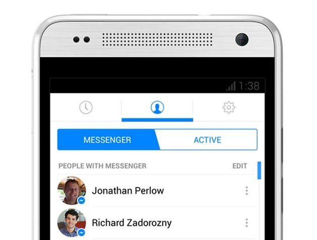
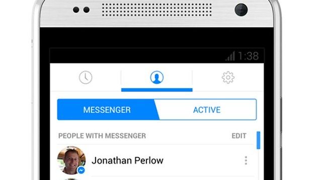
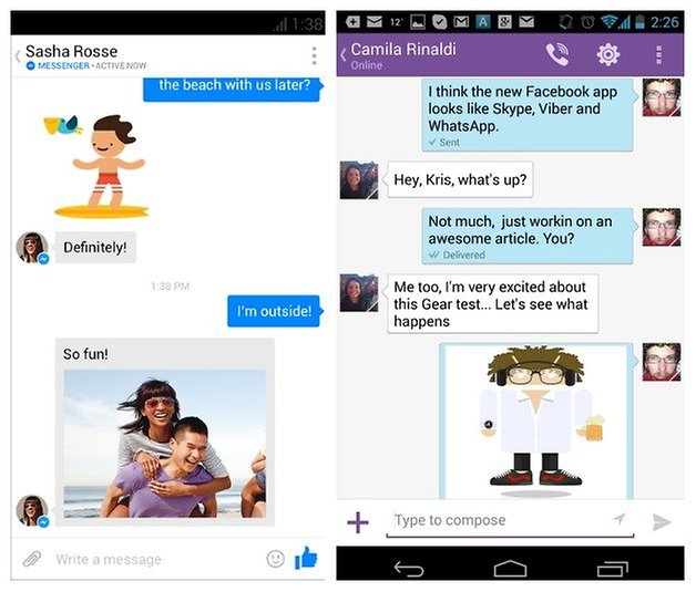
The major changes in the update are the addition of a Facebook Messenger icon that will alert you to which of your contacts are currently online, a feature I can't believe has taken this long to appear. Facebook has also added the ability to message people who are not your Facebook friends by using your phone number – very WhatsApp. Navigation is now accomplished by the old Android tab swipe and the top and bottom nav banners kind of remind me of, oh I don't know, Skype with a bit of Viber?
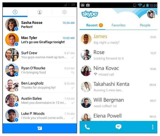
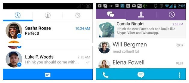
The tired blue decor of the interface is gone, replaced by a crisp white background and rounded profile icons with a light blue banner at the bottom. The solid stack of profile pics is gone in the update, replaced with rounded icons and plenty of space around them in the chat list. It looks incredibly similar to Skype. Inside a chat conversation not much has changed beyond the color scheme, but your messages will now display with white text on a blue block like the current Send button. I have to say when I first saw it, it looked a lot like my Viber chat window.
Sure, Skype has more rubbish at the top of the chat list and the conversations look different, while old app so the changes look good to me.
What do you think of the redesign of Skype, I mean Facebook Messenger? Do you think they're just borrowing the designs from other popular messaging apps?
Source: Facebook Newsroom


Yes, I think they should have kept their usual color. :-)
I prefer the new Holo look too, but it's kinda reeaaalllly like Skype now. It wouldn't have killed them to at least stick with Facebook blue rather than Skype blue, would it?
They are trying to stick to some of the Android design guidelines which the others already did, that's why they look similar now. I'm happy that they finally did the change.